There is no such thing as pixel-perfect web design
There, I said it. Now get the phrase out of your head, it doesn’t exist, please stop trying. Far too often you’ll hear some paraphrasing of the complaint “But it doesn’t look like it did in Photoshop”
Well, Why not?
For starters, a web browser isn’t Photoshop; but pixel-perfect design is still unattainable. I mean what is a pixel? splitting the word “pix-el” is short for Picture Element, the smallest unit of a picture. Chances are you’re reading this on a computer, it’s monitor probably has square pixels; but look closely at your TV and you might see rectangular pixels, magnify your newspaper and you’ll find round ones. If you happen to have a newer MacBook / iPhone / iPad, they use the amazing Retina display which packs 4 pixels in the place of 1. This unit of measurement is vastly different in every format, and we haven’t even left the sofa.
![[source]](https://en.wikipedia.org/wiki/File:Pixel_geometry_01_Pengo.jpg)
Moving the Web Forward
In our current market place, there are hundreds of web-ready devices and smartphones (and refrigerators) that are trying to access your site. Unfortunately this also causes problems because the screen dimensions on these devices vary greatly. As time passes this fragmentation problem will probably only get worse.
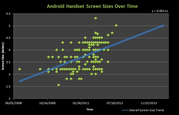
This graph is just screen dimensions for Android phones! Never mind the completely proprietary nature of feature phones and the world of tablets. You have absolutely no control over the screen dimensions your client is using, or what resolution they’re running, because of this there is no way to do a pixel-perfect design that looks good everywhere. If you try prepare to spend your resources on herding cats.
Don’t take my word for it
For me, “ideal” on the web isn’t about pixel-perfection anymore, but about seeking the most pragmatic approach to balancing different kinds of content with an ever-increasing number of screen sizes and resolutions.
A pixel is not a pixel. There are different kind of pixels: CSS pixels, density independent pixels and device pixels.
The important thing to keep in mind is that we need to stop thinking about the web in pixels and think about it more in views and how our designs will be displayed in these different views.
The control which designers know in the print medium, and often desire in the web medium, is simply a function of the limitation of the printed page. We should embrace the fact that the web doesn’t have the same constraints, and design for this flexibility. But first, we must “accept the ebb and flow of things.”
What’s the solution?
It’s just not possible to plan for every single device, so you’ll just have to embrace uncertainty “accept the ebb and flow of things.” Responsive design will help adapt, but it has its problems, you could also make a separate mobile site (and you could make that responsive), mix solutions until you find what works for you and your client. There’s more planning and experimentation in developing for the web today than there was a decade ago, and who knows what the future will bring. Technology is there to help, even if it does complicate things sometimes.
BTW, the physical pixel on the device has nothing to do with the CSS pixel, because in CSS pixels are angular measurements, i.e. they are non-linear.